Parvin grew up among the hills of Iran, with occasional visits to the Caspian Sea on the northern coast — landscapes that left a permanent imprint on how she sees the relationship between land, light, and atmosphere. She emigrated to the United States at age eight, returned to Iran for high school, then came back to the United States to study at the Chouinard Art Institute in Los Angeles — the institution now known as the California Institute of the Arts — where she graduated with a BFA in Story Illustration. The discipline of commercial deadlines shaped her: from story illustration she moved to advertising illustration, then fashion illustration, then, finally, to fine art.
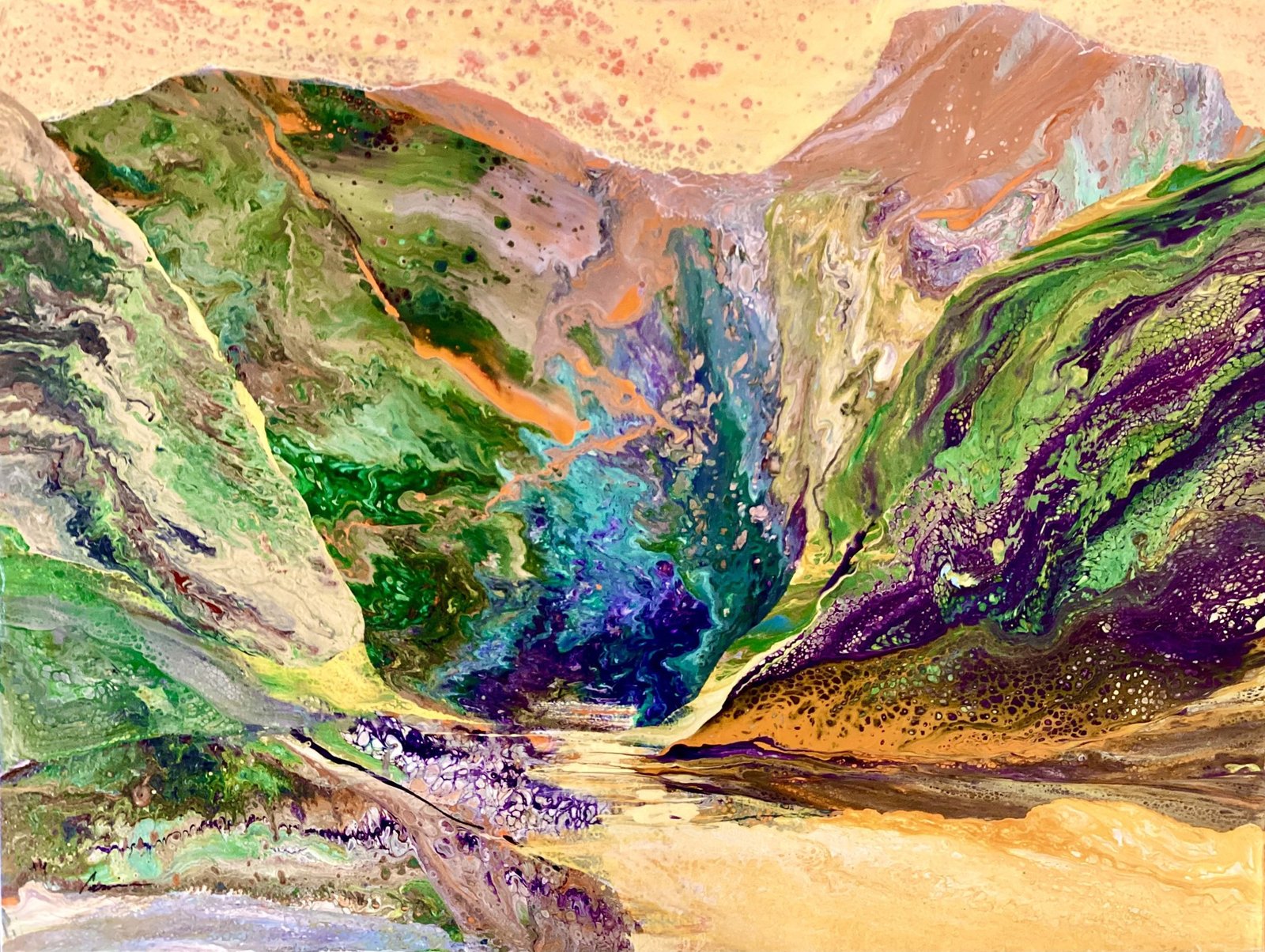
The advertising years, in advertising, demanded imaginative work produced fast, and that capacity for direct commitment carried forward. She eventually left the East Coast and the commercial world entirely and returned to painting. In Serendipity #5, The composition stages a dramatic recession into a canyon where cadmium greens and viridian pool against deep ultramarine and violet shadows, while the paint builds texture through thick impasto that catches light unevenly across the rocky walls.
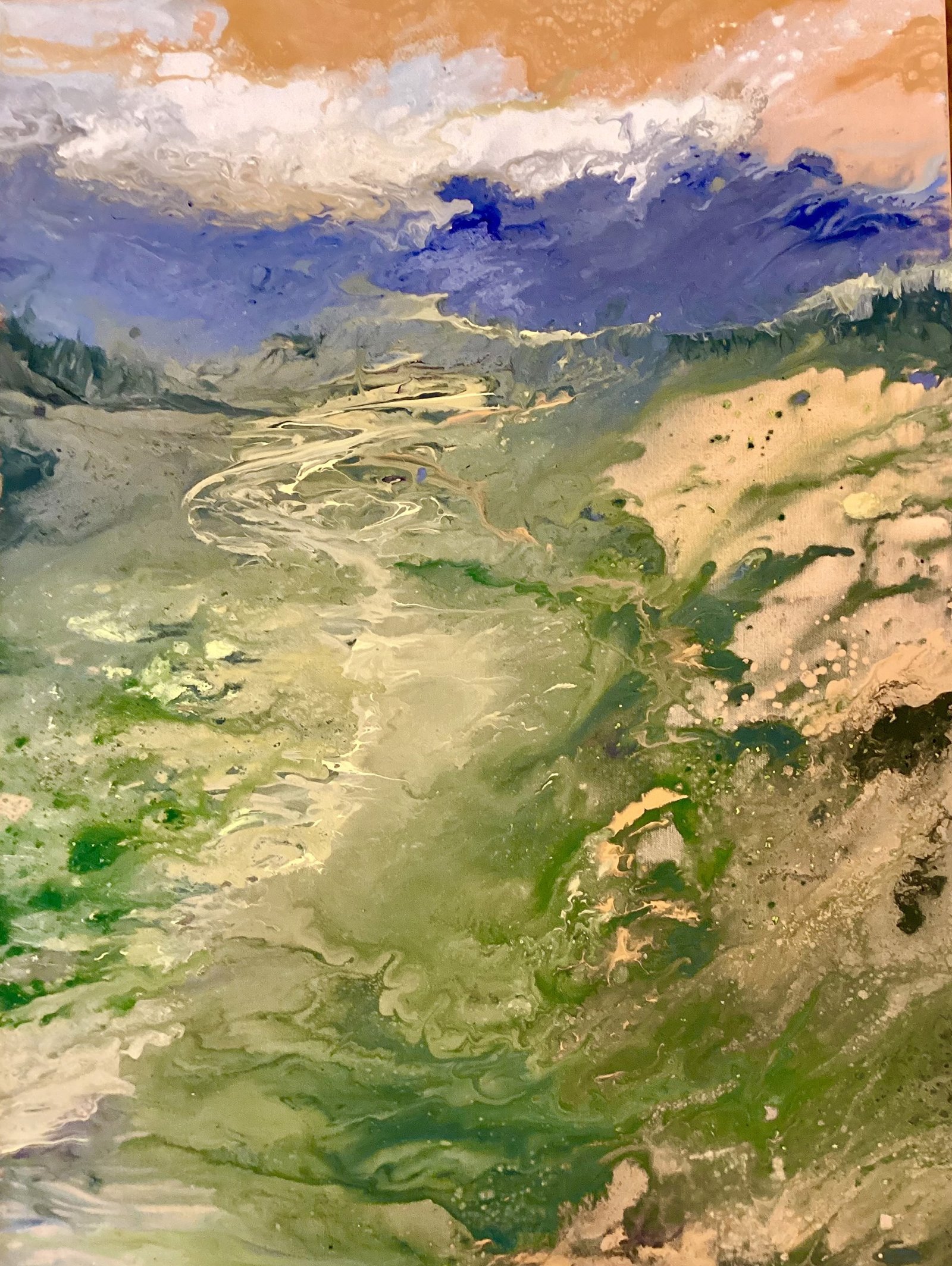
The spatial arrangement positions the viewer as if standing in a valley floor, with burnt sienna and ochre foreground anchoring the descent into cooler blues that recede toward an impossible sky of salmon pink scattered with rust. Parvin's method—layering wet pigment to create geological striations and letting colors bleed into one another—generates a landscape that feels simultaneously observed from nature and wholly invented through the paint's own behavior. In Stockfarm #2, The painting deploys cadmium yellow and viridian green across a braided river valley, with the pigment applied in thin, translucent washes that allow underlayers of raw canvas and cream to show through, creating atmospheric recession.
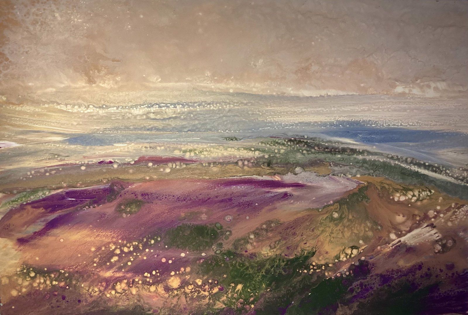
The spatial composition stacks horizontal bands—foreground scrub in deep forest green, middle distance rendered in pale olive and tan, distant mountains in periwinkle blue—each zone flattened against the picture plane yet depth through color temperature alone. The work's peculiar flatness, achieved through paint that sits on rather than into the canvas surface, paradoxically strengthens the aerial perspective, though the meander patterns of the river become almost decorative abstractions rather than navigable geography. In Wild Flowers, The artist deploys magenta and deep purple across the canvas's lower register, where gestural swaths of paint create a sense of receding depth through atmospheric perspective, while cream and ochre passages suggest distant plateaus.